Week 5-Week 7/02.05.2023-19.05.2023
Yap Guang You/0363730
Typography/Bachelor
of Design(Hons) in Creative Media
Task 2/Typographic Exploration &
Communication
Lectures
Lecture 6/Typo_5_Understanding
In this lecture we learn about understanding letterforms, we learn about maintaining x-height. X-height generally describe the size of the lowercase letterforms. The space describes, and often contained, by the strokes of the form, when the letters are joined to form words, the counter form includes the space between them. It helps to recognize the shape of the letters and assure the readability of the words.
Lecture 7/Typo_6_Screen&Print
In this lecture, we know in the past, typography was viewed as living only when in reached paper. Once a publication was edited, typeset and printed, noting can be changes. Now typography exists not only on paper but on a multitude of screens. Typography not only controlled by designers as it is subject to many unknow and fluctuating parameters. Type for print means the type was designed intended for reading from print long before we read from a screen. Designers should ensure the text is smooth, flowing and pleasant to read. Type for screen mean typeface intended for use on the web are optimized and often modifies to enhance readability and performance on-screen in a variety of digital environments. We learn about the different between static and motion. Static typography is not limited to minimal characteristics such as bold or italic in expressing word. It can also create movements and motion in a dynamic way. Motion typography is introduced ar9ound since the 1960 when feature films started using animated opening titles instead of static text. Now motion typography is widely used in various forms of animation and motion graphic.
Lecture Ex/Typo_Task2_Process Demo
In this lectures Mr. Vinod give us some basic details for our task. He show some example to us and show us the process to get a good layout. He also gave us some tips to make the expression was make sense.
Instruction
<iframe src="https://drive.google.com/file/d/1tQvuiF64eaKcjSESaPK0ooEncW20RsrQ/preview" width="640" height="480" allow="autoplay"></iframe>
Task 2: Typographic Exploration and Communication
This task is a combination of two exercises from Task 1. The task is to typographically represent the content of a 2-page editorial double spread (200 mm x 200 mm). We have to choose one as the content from the three given text options. For this task, we should use the knowledge from the previous exercises and from other modules. We should also look at the lecture video provide by Mr. Vinod, and we can only using the ten typeface provided, minor graphic elements was allowed. I choose the third text provided to continue my work.
1. Visual References
I find some interesting layout from Pinterest. I decided to use some elements in these layout in my work.
This task is a combination of two exercises from Task 1. The task is to typographically represent the content of a 2-page editorial double spread (200 mm x 200 mm). We have to choose one as the content from the three given text options. For this task, we should use the knowledge from the previous exercises and from other modules. We should also look at the lecture video provide by Mr. Vinod, and we can only using the ten typeface provided, minor graphic elements was allowed. I choose the third text provided to continue my work.
1. Visual References
I find some interesting layout from Pinterest. I decided to use some elements in these layout in my work.

|
| Figure 1.1 Layout References 1 (Week 5-06.05.2023) |

|
| Figure 1.2 Headline Expression References (Week 5-06.05.2023) |

|
| Figure 1.3 Layout References 2 (Week 5-06.05.2023) |
Image References
Figure 1.1-https://pin.it/3OpD4LA
Figure 1.2-https://www.google.com/url?sa=i&url=https%3A%2F%2Fbeeoclock.wordpress.com%2F2016%2F11%2F07%2Fthe-eye-and-the-i%2F&psig=AOvVaw3oVRuRmK-_eRHkU_4h66wO&ust=1685110504931000&source=images&cd=vfe&ved=0CBEQjRxqFwoTCNjmnf7TkP8CFQAAAAAdAAAAABAD
Figure 1.3-https://pin.it/7xtpGyn
2. Sketches
I come out 3 sketches with different layout. I decided focus on the word "Visualize" in the head line
Figure 1.1-https://pin.it/3OpD4LA
Figure 1.2-https://www.google.com/url?sa=i&url=https%3A%2F%2Fbeeoclock.wordpress.com%2F2016%2F11%2F07%2Fthe-eye-and-the-i%2F&psig=AOvVaw3oVRuRmK-_eRHkU_4h66wO&ust=1685110504931000&source=images&cd=vfe&ved=0CBEQjRxqFwoTCNjmnf7TkP8CFQAAAAAdAAAAABAD
Figure 1.3-https://pin.it/7xtpGyn
2. Sketches
I come out 3 sketches with different layout. I decided focus on the word "Visualize" in the head line
. I decided to let the top of "i" looks like an eye similar as Figure
1.2.
3. Digitalization Sketches
I selected the second sketches to digitalization it, I place the text roughly without any kerning or spacing.

|
| Figure 2.1 First Sketches(Week 6-08.05.2023) |

|
| Figure 2.2 Second Sketches(Week 6-08.05.2023) |

|
| Figure 2.3 Third Sketches(Week 6-08.05.2023) |
3. Digitalization Sketches
I selected the second sketches to digitalization it, I place the text roughly without any kerning or spacing.

|
| Figure 3.1 Progress 1 (Week 6-08.05.2023) |

|
| Figure 3.2 Progress 2 (Week 7-14.05.2023) |
After this week feedback section, I desided to work with the first sketches,
because it more easy to read as a reader.

|
| Figure 3.3 Progress 3(Week 7-16.05.2023) |
Before the final submission I make some minor adjustment to make the text
layout was following the rules that mentioned in task 1.
Headline
Futura Std Bold Condensed
Font Size:82/24/60/48(pt)
Leading:84/26/62/50(pt)
Paragraph Spacing:-
By Line
Serifa Std 55 Roman
Font Size:18pt
Leading:20pt
Paragraph Spacing:-
Body Text
Janson Text LT Std 55 Roman
Font Size:12pt
Headline
Futura Std Bold Condensed
Font Size:82/24/60/48(pt)
Leading:84/26/62/50(pt)
Paragraph Spacing:-
By Line
Serifa Std 55 Roman
Font Size:18pt
Leading:20pt
Paragraph Spacing:-
Body Text
Janson Text LT Std 55 Roman
Font Size:12pt
Leading:14pt
Characters per line:48
Alignment: Left Alignment
Margins:10mm
Columm:2
Gutter:5mm

|
| Figure 4.1 Final Submission-With Gird Jpeg(Week 7-19.05.2023) |

|
| Figure 4.2 Final Submission-Without Grid Jpeg(Week 7-19.05.2023) |
Figure 4.3 Final Submission-With Gird Pdf(Week 7-19.05.2023)
Feedback
Week 6
General Feedback: Bodoni is not that good for the body text, it's hard to read because it's too small. If
we want to add some graphic elements, make it won't attract too much of
attention from the reader. It's recommended to let the body text being an easy read
layout. The expression must be make sense, and not too much off distort.
Reflection
Experience
I used what I learned in Task 1 in this task because it is the combination of two exercises from Task 1. I started with outlines first and then moved on to headings and layout. The layout of the headline and text was slightly different from the two exercises. Unlike usual, we went through the feedback round by giving feedback to our classmates and getting their opinions as well. Mr. Vinod then gave us only a brief feedback on our work and some advice on the design of our e-portfolio.
Observation
Doing research will gave me a lot of idea, I can also learn a lot of things from the others works. After the feedback section, discussion with others will help a lot, knowing each other opinion is important, I can get some new idea during the feedback and discussion section. Following the rules given at task 1 will make my work looks more tidy, and keep thinking can let my exploration make more sense. Mr. Vinod feedback help me a lot for my task.
Findings
Knowing the rules is important before breaking the rules, it's highly mention during this task. I found that using different view can improve my work, for example after sketching out my idea, I will make a rough digitalization, and try to read it to check the difficulty to read, it help me to come out with the comfortable layout to read. What did I learn from task 1 helps me a lot in this task, I be more aware about the spacing and the rules.
Further Reading
|
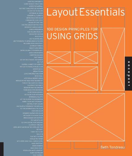
| Layout Essentials: 100 Design Principles for Using Grids by Beth Tondreau. |
This book presents a comprehensive exploration of fundamental layout and grid principles. Through 100 informative entries, it covers a range of topics including selecting appropriate typefaces for projects, achieving rhythm and balance with typography, effectively combining different typefaces, utilizing special characters, optimizing kerning, and enhancing legibility. The book offers practical examples and demonstrations to illustrate these guidelines and rules.


No comments:
Post a Comment