04.04.2023-04.05.2023/Week 1-Week 5
Yap Guang You/0363730
Typography/Bachelor
of Design(Hons) in Creative Media
Task 1:Exercises 1&2/ Type Expression& Text Formatting
Lectures
Lectures 1/Typo_0_introduction
In this
introduction part, I have learn that typography is a fundamental skill set for a
designer, we can use typography on many things, typography is now something
everybody does, it let communication more effective. This modules is trying to
teach us express something visually with text, also reading is important for
learning typography or anything else. Typography have been evolved over 500
years from calligraphy to lettering to typography, calligraphy is about writing
out the text, in the earlier times people will judge your education level by
your hand writing, this is why calligraphy is important. The definition for
typography from Wikipedia said that typography is the art and technique of
arranging type to make written language legible, readable, and appealing when
displayed. We also learn the different between font and typeface. A font refers
to the individual font or weight within the typeface. Typeface refers to the
entire family of fonts or weights that share similar characteristics or
styles.
Lectures 2/Typo_1_DevelopmentWe have learn the time line off the font development in this week lecture section, the lecture is focus on from Phoenician to Roman. Tool and materials mentioned was important to affect a creation of a font. The Greeks change our reading habit, they write and read from right to left, it still be following in the modern era. Square capitals were the written version that can be found in Roman monuments, then the rustic capitals is a compressed version of square capitals that were faster and easier to write. Charlemagne is the first unifier of Europe since the Romans, issued an educt in 789 to standardize all ecclesiastical texts. Gutenberg is the person that invented modern printing, people can produce and disseminate knowledge more and faster, this technique was first used in the production of Bibles. Then type forms have devoloped in response to prevailing technology, commercial needs, and esthetic trends. Certain models have endured well past the cultures that spawned them. Blackletter(1450) was the earliest printing type, Old Style(1475) is based upon the lowercase forms used by Italian humanist scholars, then the Italic(1500) was echoing contemporary Italian handwriting.
Lectures 3/ Typo_2_Basic In this lecture, we learn about the basic of typography. First we learn "Baseline" as known as the imaginary line the visual base of the letterforms, "Median" is the imaginary line defining the x-height of letterform, "x-height" is the height in any typeface of the lowercase 'x'. Then we learn the part in letterform, such as stroke, apex, arm, bard, bowl and etc. We also learn that the full font of a typeface contains much more than 26 letters. A full font group was group by uppercase, uppercase numerals, lowercase, lowercase numerals, punctuation and miscellaneous characters. An ornaments usually are provided as a font in a larger typeface family, used as flourishes in invitations or certificates. Some font style was introduced to us such as, Roman, Italic, Bold, Light, Condense and Extended.
Lectures 4/ Typo_3_Text_P1
In this lecture part, we learn about text formatting, we learn about the word "Kerning" refers to the automatic adjustment of space between letters, we learn about when to kern and when do we don't kern. Mr. Vinod mentioned that we are going to work more with Adobe Indesign, and he show us some technique in the app. Then we learn about normal tracking, loose tracking and tight tracking, we have be recommended not let the space over case. Then we learn about some formatting style, such as flush left, flush right, centered and justified. Type that calls attention to itself before the reader can get to the actual words is simply interference and should be avoided, a good typographer has to know which typeface best suits the message at hand.
Lectures 5/TYpo_4_Text_P2In this lecture, we learn some way for Indicating paragraph. We can use the 'Pilcrow', line space(the leading and paragraph spacing must be the same point size) or indentation to indicating our paragraph. A standard indentation is the indentation of the first line in paragraph, the ident is the same size of the line spacing of the same as the point size of the text. We also learn about widow and orphan, then we learn how to avoid them. A widow is a short line of the type left alone at the end of a column of the text, we can avoid it by creating a force line break before or adjust the letter spacing. An orphan is a short line of the type left alone at the start of a new column, we can avoid it by adjusting the length of the column. We also learn some way to highlighting text and different type of headline within text and cross alignment.
Lectures Ex/ Typo_Ex_Animation BasicIn the lectures video Ms Vinod show us how to make a short gif by using Adobe Illustrator and Adobe Photoshop. We need to create few continuous art board in Illustrator then export them to the Photoshop time line, then the animation was done.
Lectures Ex/ Typo_Ex_Text FormattingIn this lecture part, we learn about how to use Adobe InDesign, we learn how to do our kerning and tracking. Mr. Vinod show us how to place image into the file, and also told us what should be avoided and what was recommended to do in the text formatting task.
Instructions
/><iframe
src="https://drive.google.com/file/d/1tQvuiF64eaKcjSESaPK0ooEncW20RsrQ/preview"
width="640" height="480" allow="autoplay"></iframe>
Task 1:
Exercises- Type Expression
For exercise 1, we have given seven words
to make type expression. We were required to choose four words among them. The
seven words given is: Speed, Shatter, Melt, Kill, Blur, Dance, Throw. We were
instructed
to sketch out the type expression of those words we choose, it was required
three sketches
for a words but recommended four for a words.
1. Sketches
I have chosen the words, Kill, Throw, Melt and Shatter for my type expression
sketches.
Figure 1.1 Kill Typo Expression Sketches (Week 1-09.04.2023)
1. For the first sketches, I try to combine the murder tools with the word
"Kill" so I let the "i" to be a
bullet then the letter
"l" to be a knife. I put some bleeding effect on the knife to let it feel
more
bloody vibe.
2. The second
and third sketches, I try to sketch out the movement about the word "Kill".
So I trying to
sketch out that the letter "i" get shotted
by an arrow, the second is the arrow cross all the letter and
the third one, the arrow just shotted the letter "i".
3. The
last sketches, I sketch out that there are one side of the letter being a
blade with the bleeding
effect so it can have more
connection with the word "Kill".
Figure 1.2 Throw Typo Expression Sketches (Week 1-09.04.2023)
1. The first sketches, I trying to sketch out some basic movement about
the word throw. So I sketch out
the letter "w" have
been throw out from the arrangement.
2. The second sketches,
I am trying to combine the item that what will I think when I hear the
word
"Throw". I let the letter "H" to be the rubbish
bin and the "O" to the the rubbish.
3. The last sketches, I sketch
out the "r" as a person "o" as a rubbish "w" as the rubbish tank. So it
looks
likes a person throwing a rubbish in to the
tank.
Figure 1.3 Shatter Typo Expression Sketches (Week 1-09.04.2023)
1. The first sketches, I make some cracks effect on all the
letter, to bring out the shatter feeling .
2. The second and
the third sketches, I decided to express the word "Shatter" more
directly, so I try to
sketch out the
word like broken glass.
Figure 1.4 Melt Typo Expression Sketches (Week 1-09.04.2023)
1. For the first sketches, I add some basic melted effect
on the bottom of the letter. But I decided to
make the effect more obvious, so I
sketch the third typo expression, all the letter are melted so
it
more closer to the melting effect.
2.
The second sketches, I sketch out the letter starting disappear
because of melting.
2. DigitalizationAfter sketch out the ideas we are be instructed to
transform our sketches into digital by using Adobe Illustrator.
We being asked to finish the typo express by using the ten font
and typefaces that given to us.
Figure 2.1 First attempt (Week 2-16.04.2023)
1. Kill- I use Furuta Standard Bold for the word "Kill". I
choose the first idea for my "Kill Sketches". I
let the letter "i"
be a bullet but didn't turn the letter "l" into knife, I
turn them into two blade, so
it won't be too distort the
original "l".
2. Melt- I digitisation the first sketch
of "MELT" by using Univers Lt Standard Bold. I use the
pencil
tool to add some liquidization effect
at the bottom of these letter so it can looks like the
letter
are melting.
3. Shatter- The word "Shatter"
combine the first and second idea from the sketches, I use
the Futura
Standard Book to let the
expression looks more solid. I use pencil tool to draw out
the empty
space to let the letter looks like
broken.
4. Throw- I use Bodoni Mt Bold to bring out the
first idea of my sketches. I move and rotate the
letter
"o" and "w" to let them looks likes been
thrown from the arrangement, I am trying to let the
letter to be the person who throw the letter to
add more movement for the expression.
Figure 2.2 Second attempt (Week 3-18.04.2023)
After listening to the feedback from Mr. Vinod and
looking the work of others I decided to make some minor
adjustments to my work. First, I adjust the composition
of each words too let them looks right on the art board.
Then, I rotate and move the "i" for "Kill" to create the
feeling of the letter "l" being shot through by a bullet
to add more movement for the word "Kill". I shifted the
arrangement of the word "Shatter" slightly to let it
feeling more fragmented. I revert the letter "r" to the
original one for the word "Throw" because I think that
was too much distort to the "r" in the first attempt.
Figure 2.3 Type Expression Final Submission (Week
4-25.04.2023)
3. AnimationAfter digitalization our
sketches, we have be asking to choose a word among the
four words and add some animation into it.
Figure 3.1 Animation Artboard (Week
3-24.04.2023)
Figure 3.2 Animation Timeline (Week 3-24.04.2023)
Figure 3.3 Kill Typo Animation GIF
(Week 3-24.04.2023)
I choose the word "Kill", because the
bullet can show more movement for the word
"Kill", so I decided to let the bullet to
shoot through the "K" and the "l" to bring
out the meaning and movement of the word. I
made some continuity artboards in Adobe
Illustrator and combine them into a short
GIF by using Adobe Photoshop.
4. Redo Animation
After getting feedback from Mr.
Vinod, I have be asking for redo my
animation work. It was not stable on the artboard and too much of distort. I decided to let the animation to be very stable and easier, so I revert all the letter and just focus in the letter "i". I didn't change my idea so the "i " will still be the bullet but it a big different comparing to the first animation I have done.
 |
| Figure 4.1 Second Attempt Animation Artboard (Week 4-25.04.2023) |
Figure 4.2 Animation Final Submission (Week 4-26.04.2023)
Task 1: Exercises 2: Text Formatting1. Kerning and Tracking We have be asking for kerning our own name by using InDesign. I watch the lecture and I just follow what Mr. Vinod show in the video, then I finish the kerning exercises using the ten fonts provided.
 |
| Figure 1.1 The name without Kerning (Week 4-25.04.2023) |
Figure 1.2 The name with Kerning (Week 4-25.04.2023)
2. Layout Exercises
We have be asking for coming out some layout by using the text given. After watching the lecture video, I am trying to do what Mr. Vinod show us in the video. So I come out with the rough layout show below.
 |
| Figure 2.1 Rough layout (Week 4-26.04.2023) |
After having feedback from Mr. Vinod to us, I decided to make some adjustment on my layout. So I create a new layout show below.
 |
| Figure 2.2 Adjusted layout (Week 5-02.05.2023) |
3. Final Submission- Text Formatting Layout
I have some idea from other's work so I decided to make some major adjustment for my final submission.
Headline
Futura Std(Bold)
Font size:60pt
Leading:72pt
Paragraph spacing:-
By line
Futura Std Light Oblique
Font size:24pt
Leading:28pt
Paragraph spacing:-
Body Text
Univers LT Std Roman 55
Font size:9pt
Leading:12pt
Paragraph spacing:12pt
Aligment:Left Alignment
Characters per line:58
Captions
Serifa Std 45 light
Font size:12pt
Leading:15pt
Paragraph spacing:-
Margins:12.7mm
Columm:4
Gutter:4.233mm
Figure 3.1 Text Formatting Layout Final Submission-No Gird Jpeg (Week 5-04.05.2023)
Figure 3.2 Text Formatting Layout Final Submission- Girded Jpeg(Week 5-04.05.2023)
Figure 3.3 Text Formatting Layout Final Submission-No Grid Pdf(Week 5-04.05.2023)
Figure 3.4 Text Formatting Final Submission- Grided Pdf(Week 5-04.05.2023)
Feedback
Week 2
General Feedback: For this week Mr. Vinod gave us some advices for the sketches. Thumd size
sketches are reccomended for sketching the ideas, then choose the idea we
want and sketch out the details. I think my sketches is big, so I think I might
goinng to downsize it. The typo expression must not confuse the viewer to
read out the words, I think my design is good the readerto pronounce the
words. It also be reminded the design must be easy and do not distorts the
meaning of the words, I think I have some design is to complex and a bit of
distorts the meaning.
Week 3
General Feedback: For this week. Mr. Vinod gave us some feedback for our works. Spacing for
the words is important, and make sure the word was looking good on the
artboard, the works should be stay close with the meaning of the words given.
The word kill might not be relative with the meaning. The works can be
improve by adding more details.
Week 4
General Feedback: Some GIF looks no smooth enough is because not enough of frame. It's 24 or
25 frame per second in an animation work. The GIF can be smoother by
adding on more frame.
Week 5
General Feedback: If we need to change our alignment, make sure there are no formatting on the text.
After changing the alignments, do the kerning and tracking again. Close your eye
to check the text either even or not.
Reflection
Experience
The classes during these four weeks are pretty intense for me. We have been working on Task 1 piece by piece each week to ensure our progress, and getting feedback from Mr. Vinod each week to improve our work. We also look at classmates' work, and I was able to learn from their ideas and feedback from Mr. Vinod. Mr. Vinod always gives us advice on active learning, but not only to finish our work before the deadline. We also watched the lecture videos to learn the basics of typography.
Observations
I have noticed that I have gone into more detail in my work. I have noticed that we complete our work piece by piece each week, receiving extensive guidance and absolute feedback, which is very helpful in the learning process. I noticed that sometimes I overlooked important information and work requirements from Mr. Vinod. For example, I have difficulty expressing words in animation because I do not know how animation works.
Findings
We are going to work more with letters in the future. It's the basic in communication, and it's also an art. A good typography required details works and express the feeling logically. I found I become more sensitive to the letters and the meaning of the words. I have found that I rarely ask questions in class, it is not an effective way to learn. I should get out of the habit of being spoon-fed by the instructor and practice critical thinking and active learning. I should pay better attention in class so as not to miss important information.
Further Reading
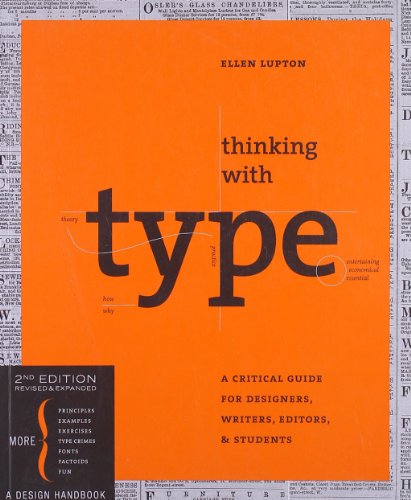 |
Figure 5.1 Thinking with Type by Ellen Lupton (Week 3-16.04.2023)
|
So this is typography modules, I search online to find some recommended book to learn typography, then I found this book name, Thinking with Type by Ellen Lupton. Then I read the book, This book have a clear introduction to typography, covering everything from basic terminology to advanced concepts such as hierarchy and composition.
What I particularly liked about this book is that it not only explains how to use typography effectively, but also why typography is important. The author convincingly lays out the role typography plays in shaping our understanding of written language and how it can influence our emotional response to text.
Overall, I think Thinking with Type to be an excellent resource for anyone interested in typography, specially for beginner. I learn a lot from this book, I hope the content inside the book will help me in this modules.


